7 Common Mistakes Made By Luxury Websites
 Contributed by
Florine Eppe Beauloye
May 30, 2016

Luxury websites are usually slick and elegant, but many are failing to deliver the most fundamental requirement: a first-class user experience.
From intruding animations to pages that are frustratingly slow to load, it is paradoxical to think that premium and luxury brands offer such poor online experiences.
To help you avoid these pitfalls, we analysed the websites of some of the world’s most renown luxury brands, including Patek Philippe, Hermès, Versace, Givenchy and Yves Saint Laurent and listed seven common website mistakes that are negatively impacting user experience.
Website Mistake #1: Slow Load Times
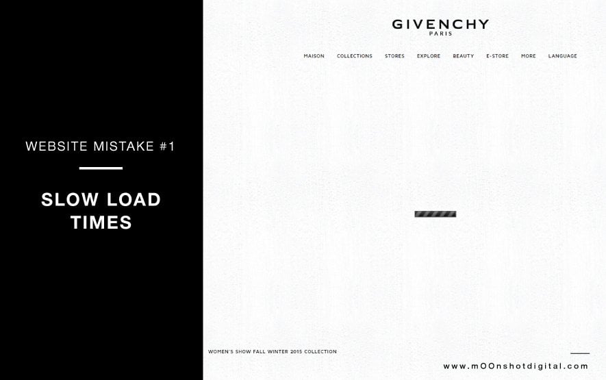
Page-loading time is a key element of any website user experience. A lengthy page-load time is an invitation for the visitor to click away. In fact, nearly half of online visitors expect a site to load in two seconds or less, and they tend to abandon a website that isn’t loaded within three seconds.
Unfortunately, slow loading times appear to be a common theme among luxury websites, which often perform poorly due to a lack of optimisation.
But websites do not need to compromise on speed to accommodate better aesthetic design with all the bells and whistles. Rich graphics and images can be used, but they should always be optimised to ensure great website performance.
Website Mistake #2: Poor Readability
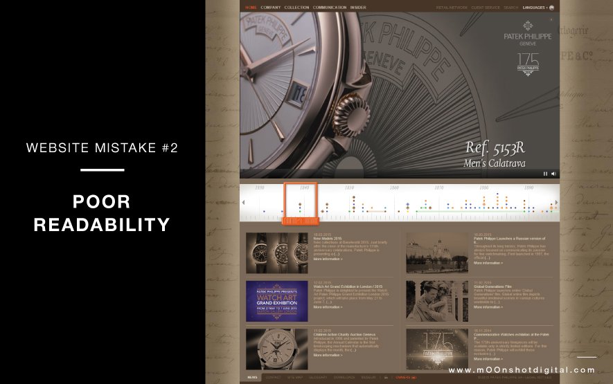
Readability is a crucial component of a website’s usability. No matter what message you are trying to get across, nothing will get through if the content just isn’t easily visible. Yet many luxury brands make design choices that are challenging from a user-experience perspective, including:
- Fancy font styles that may be pretty but are just impossible to decipher
- Tiny font sizes that require a magnifying glass to view properly
- Low-contrast colour schemes that make reading very tiring for the eyes
Website Mistake #3: Splash Page And Intruding Animations
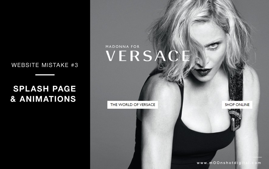
How often have you been on a luxury website and forced to watch an introduction while desperately trying to find the ‘skip to home’ button hidden in a small corner of the page? How frustrating is it when you land on a splash page and have to make that extra click to access the content you actually care about?
While some may argue that this is an integral part of the immersive luxury brand experience, it should be at the users’ discretion whether or not they view the splash screen promotions or videos.
Splash pages are usually graphically rich, but often completely unnecessary and can have harmful effects on website performance and search engine rankings.
Website Mistake #4: Mystery Navigation
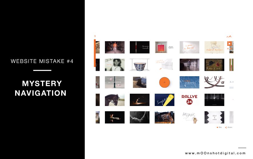
Up, down, left, right … Where am I? Where have I been? Where can I go next? Navigating through some luxury websites can be overwhelming.
Visitors want to access information in the most timely manner. Unfortunately, many luxury websites do not have a clear navigation path and do not incorporate site search.
Plus, many luxury brands fail to use the most relevant descriptive terms that are most helpful to their target customer base. Instead, luxury brands use ambiguous names for web pages that do not clearly define what each page features.
Website Mistake #5: Automatic Sound
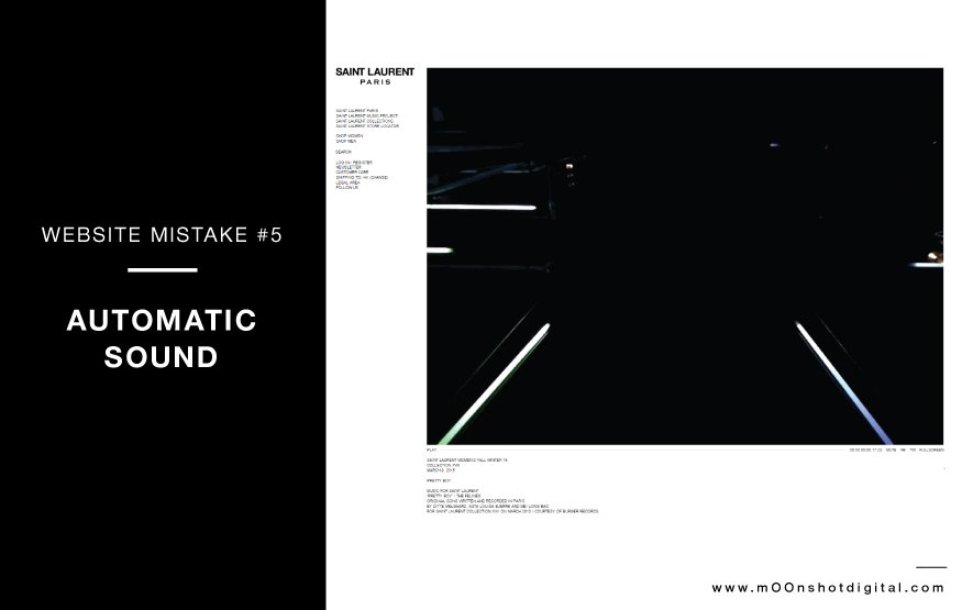
Imagine that you open a website at the office, in the library or any other quiet public space and suddenly some loud music hits you in full swing. You can’t immediately locate the mute button so you reflexively close the site to make it stop. Sound familiar?
Many luxury brands incorporate background music and videos that autoplay as soon as a visitor arrives on the site. Unfortunately, more often than not, these imposed sounds are intrusive and can be very irritating, especially when blaring out when you least expect it. It’s important to always display a prominent audio control so that users can easily stop the music or change the volume in a hurry.
Website Mistake #6: Not Optimised For Mobile Devices
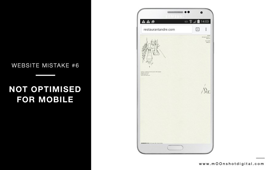
The luxury shopper is more mobile than ever. Providing a seamless user experience across all devices is thus paramount if luxury brands want to reach consumers in all the moments that matter. But, surprisingly, many websites are still not optimised for mobile devices.
Note that Google officially announced that, starting from 21st April 2015, they will rank mobile-friendly websites higher in their search results.
Website Mistake #7: Not Optimised For Search Engines
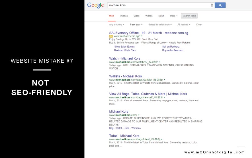
The correct technical setup of a website is a key element of SEO. Unfortunately, luxury brands often ignore SEO best practices and, as a result, search engines are often unable to index all their pages.
SEO is an untapped opportunity for luxury brands. Luxury shoppers are indeed increasingly relying on Google search and social networks to find products, engage with their favourite luxury brands wherever and whenever they want, and make their purchase.
The Delicate Balancing Act
Web design trends come and go, but one thing will remain constant and that’s the need for a user-friendly and functional website.
While we understand that high-end brands strive to maintain an air of exclusivity that feels aspirational and not overly accessible, this should not be done at the detriment of a great user experience.
There’s no doubt that exquisite aesthetic design is key when developing a luxury website. But much like the in-store luxury experience, which is crafted with meticulous attention to detail and centered around the every need of the discerning customer, luxury websites must mirror this thoughtfulness. They must find the right balance between luxury design and great usability and functionality.
Contact our team at mOOnshot digital if you need help developing your user-friendly fully responsive website.
Executive Lifestyle is growing directory of business experts and lifestyle professionals
This article was first published on mOOnshot digital blog and has been reposted on Executive Lifestyle with the permission of the author.
Edited by Nedda Chaplin
Image credit: mOOnshot digital
References:
Plus, Google. 2016. "How Loading Time Affects Your Bottom Line". https://blog.kissmetrics.com/loading-time/.
"Finding More Mobile-Friendly Search Results". 2016. Official Google Webmaster Central Blog. https://webmasters.googleblog.com/2015/02/finding-more-mobile-friendly-search.html.
Did you enjoy this post? Please comment, like and share!


Sorry, the comment form is closed at this time.