High-Impact, Low-Budget Reception Areas
 Contributed by
Amy Picanço
May 20, 2016

These days, everyone is trying to do more with less; people want to create high-impact spaces but on a low budget. So how do we do this? We get creative…
Let’s start with one of the most important spaces of your office – the reception. This space is where your clients form their first impressions and you want them to be good! In fact, if it is true that the eyes are the windows to the soul, then it stands to reason that your reception area is like the window to your company’s soul. It is the face of the operation, the first thing your visitors see and the initial factor on which they will form their judgments. Your reception area should reflect your corporate branding, image, philosophy and values.
But you don’t need to spend thousands to make a good impression. With some creativity and good planning you can create, on a low budget, a high-impact reception area that is still highly functional.
The First Impression: High Impact

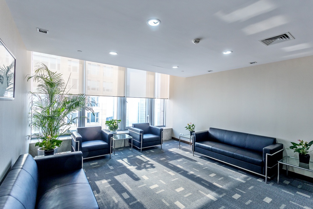
As we mentioned above, the purpose of the reception area is to welcome visitors, set the tone of the office and allow your clients to feel comfortable and relaxed before they enter the main office. The more at ease they are before going into meetings, the better the potential outcomes are for your business. High ceilings and natural lighting are a great way to make people feel at ease. If your office is located in a place that gets lots of sun and good views, take advantage of this by keeping the space as open as possible and minimise the use of partitions.
You must also think carefully about your colour scheme, as colour is one of the easiest, quickest and cheapest ways to create impact. With just a lick of paint you can personalise the space and highlight your brand. Make sure you are consistent in your choices. The brand palette should be considered and applied to every design decision from the carpet to the upholstery.
There have been numerous studies on the connection between colour and mood. One study suggests that as much as 60% of one’s feelings about a product or place (such as an office reception area) are influenced by colours. In instances where the brand is not linked to any particular colour scheme, light blues and greens are very effective in creating a peaceful and relaxed atmosphere.
The Reception Desk

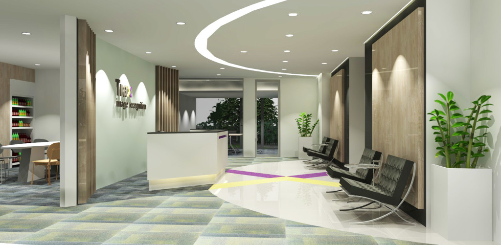
The reception desk is the center-piece of your company’s reception area and is often at the heart of everything that happens in the office. With this in mind, you’ll want to design a desk that is both functional and aesthetically consistent with the overall design.
There is no need to invest a fortune and over complicate this piece of furniture. Just be creative, think about your brand, and keep two words in mind: adaptive and functional. It must be a place where your reception staff can work effectively and have all the tools that they need within easy reach.
Positioning is key when drawing up a reception area design. It’s highly recommended that the reception desk sits directly opposite the front door. What could be better than immediately greeting your visitor with a warm smile and a friendly hello!
Make Your Reception Area Multi-Functional
Corporate office space is shrinking each year. Large sprawling offices are giving way to compact, efficient office designs. To get more out of your reception area, double it up as a break-out or informal meeting space. It is the perfect area for teams of four or five people to quickly gather and brainstorm away from the chaos of the main workspace.
Don’t Neglect The Little Things
It’s often the small touches that have the biggest impact in creating a great first impression for your business. Here are some quick and inexpensive tips to bolster the overall impression of your reception area:
- Use spotlights to draw attention to your company logo.
- Be sure to offer coffee/tea/water to guests as soon as they enter.
- Showcase your brand and services – display your products or leave your business portfolio out for your clients to flick through while they wait.
- Highlight awards and achievements, and position yourself at the top of your field.


Sorry, the comment form is closed at this time.