Is It Time For A Logo Refresh?
 Contributed by
Vicki Lew
August 11, 2015

If your company has been around for some time, it’s important to evaluate your logo to see if it is working in the favour of your business.
Giving your business logo a little nip and tuck should always be a business-driven decision, and not because you’ve gotten tired of looking at it. It’s not always necessary to undergo a total rebranding.
Some common deciding factors for a logo refresh:
- Microsoft Word just doesn’t cut it. Your logo design was a DIY job and it’s time for a more polished, professional look.
- Unintentionally ‘retro’. Your logo is starting to look dated and tired, and we’re not talking about ‘hipster vintage’.
- Less is more. Your logo is complicated and needs to be simplified in order to stand out.
- Trend-setting, not trend-following. Your logo followed a design trend, and now that trend is dead.
- Identity crisis. Your logo doesn’t represent the evolution of your business.

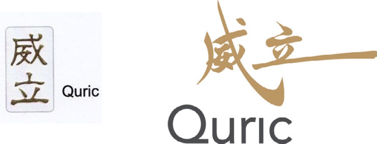
Many of our clients opt to keep selected visual elements of their original identities to maintain a visual continuation and facilitate a smoother transition. Sometimes, it is for sentimental reasons as well. Here are samples of logo refresh projects we’ve brewed:

EXIM Manufacturing Enterprise

Quric Construction
Logo refreshes are a quick and efficient way to give a new boost of energy to your business brand. There are many angles to approach the update, such as a new colour palette, a more suitable and scalable font family, or modernising an existing symbol or icon.
So it’s time to have a look at your own logo, and decide if it needs a ‘facelift’. If you’re having trouble deciding, feel free to seek our professional opinion, or tweet us!
Visit Brew Creative page to find out more about Vicki Lew's work.
This post was first published on Brew Creative blog and has been reposted on Executive Lifestyle with the author's permission.
Did you enjoy this post? Please comment, like and share!


Sorry, the comment form is closed at this time.