Why You Need A Brand Guide For Your Business
 Contributed by
Vicki Lew
July 17, 2017

(A.K.A How To Make Your Life Easier).
What is a brand guide?
It’s simply a document that describes and defines what and how your brand’s visual communications should be used and applied on print, online and broadcast mediums. A brand guide should be the primary and unifying source of such information.
Why should I create a brand guide?
Without a brand guide, you’ll probably experience incorrect and inconsistent versions of your logo being used, or a lack of clarity of what fonts, colours or tone of voice to use. This results in mixed marketing and advertising messages to your audience and may undermine your professionalism. You really don’t want your brand to be diluted in any way. Having a brand guide will keep everything on point and consistent.
A brand guide also helps you to be efficient in on-boarding a new team member, strategic partner or a supplier/vendor. By providing them with a brand guide, you won’t need to keep explaining or briefing them again and again. This helps you to get projects and tasks done quickly.
Get the brand guide done once and done right to make your day-to-day work life easier.
What should go into a brand guide?
It doesn’t need to be complicated. As a rule of thumb, these are the must-haves:

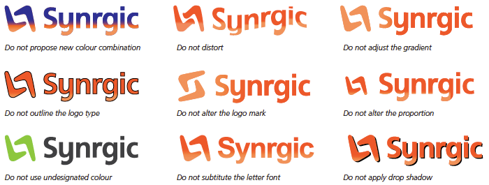
1. Your official logo and the dos and do-nots of using it
You should include black & white versions of your logo, how to use it with or without your tagline or even a horizontal or stacked version of it. You may also want to set a minimum size that is allowed to keep your logo legible. Other examples would be how to use your logo on a background image or colour.

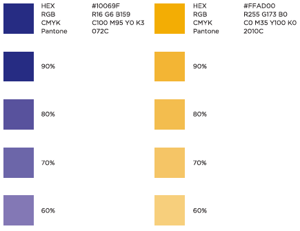
2. Colour palettes
This blue is not that blue. Colours come in a mind-boggling range of hues and are identified by colour codes like Pantone, CMYK, RGB or hex codes, depending on the usage and application. For example, Pantone and CMYK are used for print. Don’t play guess the colour – you should know the exact colour palette that has been defined for your brand, and define their colour codes clearly.

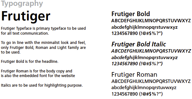
3. Typography
Fonts to use on your collaterals should not be picked on a whim. Have a official primary and secondary font, and even a font for web use. This will eliminate the need to select fonts when putting your collaterals together, and help you avoid ending up with something that looks like 10 different people put together.

4. Visual styles and treatment
What kind of imagery should be used? Should a graphic style be applied to it, e.g. a washed out look? What should custom photography look like? This extends to other visual elements such as icons. Place a few examples in your guide to help you stay on track.

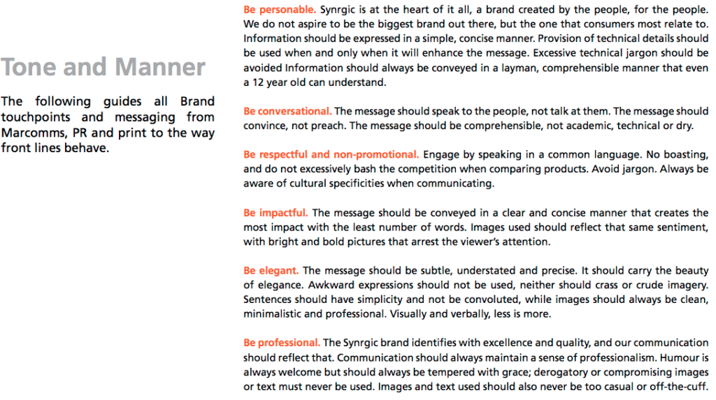
5. Tone of voice
Every business has a personality. Are you informal and friendly, or a little more serious and formal? Describing the type of language that should be used will help to create a persona for your business. You should also have some paragraphs of copy as an example.
A brand guide is a living thing
A brand guide may change as your business blossoms and grows. Needs may expand, or certain improvements need to be made. Whilst the guide is the North Star for your visual communications, it doesn’t mean it is set in concrete. The main point here is that strong and intentional decisions should be made and catalogued into the guide, so you don’t apply elements based on a whim.
Examples of brand guides
Brand guides come in different extents and could be delivered as a PDF or a webpage. It really depends on your needs.
Short and sweet: MailChimp1 and Slack2
In-depth: Skype3 and Facebook4
Brand guides we’ve brewed: Udders Ice Cream5, Exim Manufacturing6 and Synrgic7
(Disclaimer: All brand guide examples are copyright of the respective companies.)
Having trouble defining the styles and guidelines for your brand? Sometimes you’re too close to your own brand and need an outside perspective. We can help – just send us a love letter8!


Sorry, the comment form is closed at this time.